|
|
ForumsSega Master System / Mark III / Game GearSG-1000 / SC-3000 / SF-7000 / OMV |
Home - Forums - Games - Scans - Maps - Cheats - Credits Music - Videos - Development - Hacks - Translations - Homebrew |
View topic - Avatars
 |
| Author | Message |
|---|---|
|
Avatars
|
|
I think Avatars would be great.
An alternative would be that your name appears in a different color to find what you wrote easy. You can only see it in a different color when you are loged on. |
|
|
|
|
|
|
|
We don't want avatar to preserve the forum from visual pollution.
AFAIK you don't see your name colored differently when logging in, do you? I never thought this feature could be useful, it's not something that I usually need when reading posts because I check the author's name anyway. Other opinions on that? |
|
|
|
|
|
|
|
Sorry to not bat for your team Furanku, but I do have to agree with Bock. I like this forum cause its un-cluttered.
Also Avatars take server space and small chunks of bandwidth everytime a thread is loaded which is something this website doesn't have much of |
|
|
|
|
|
|
|
If people really want to customise their profile a bit, there may be a good middle ground here. Might I suggest having a few different preset avatars to choose from. Make them small, for example SMS sprites like the random ones on the main website, but not zoomed in. That way people can pick their favourite character/item/whatever, but they won't break the forum's theme and most of the time they will be cached by people's browsers. An 8 colour 24x32 GIF image shouldn't take any real bandwidth (probably less than 400 bytes).
Just a thought. :) |
|
|
|
|
|
|
|
I do find sometimes this forum is a little hard to read than most simply because so much of the text/background is similar. It's nothing that major though. On my forum I alternated posts by color, so first post is one color, second is another, third is back to first color, etc. Just makes it easier to read posts I believe, though others probably don't like it so you can never please everyone. :)
In regards to avatars you could have people link to offsite ones if bandwidth was a concern, though that presents its own issues. Sure is a lot of aussies in this thread. :) |
|
|
|
|
|
|
| Maybe we can add our own catch phrase or choose our own font style to be a little more individual. | |
|
|
|
|
|
The point of this forum is that what you actually do and say shall makes you "a little more individual", as opposed to funny geek quotes or colored Comic Sans MS writing. |
|
|
|
|
|
|
|
Avatars, mjeh, I dunno. I'm indifferent to it. Though I guess a picture of your favourite SMS-character would be nice, but then at some point someone would add something that's not relevant to the SMS universe and then it would be abused (just like Sega itself is today.)
I guess I'm fine as it is right now (even though I don't post much, I do read everything) But I swear, if you so much as think about implementing signatures I will come to your house and burn your Phantasy Star collection. There's nothing more annoying and time-consuming than having to read the same lines over and over and over and over again. There's an IRC-channel for everyday talk. And good material and articles are more often put up on solid websites or blogs. To me a Forum is some kind of weird middle-ground. I'm not trying to piss anyone off, I'm just venting cause I like this forum and I'm typing really fast cause I really have to poop. <3 |
|
|
|
|
|
|
Haha, I agree. Nothing more frustrating than reading a thread where the signatures take up more space (and text) than the actual content of the posts. |
|
|
|
|
|
|
|
This is phpBB, we actively disabled all that crap.
I did enable "zebra striping" in a test board (alternating background colours to separate posts) but Mr. Bock vetoed it. Avatars would only happen if they were strictly controlled (maybe even admin-approved), forcibly unique (no preset list), and the board was otherwise almost devoid of images. I am working on a custom phpBB3 style recently, that will be *less* cluttered than this one. However, I'm also considering alternatives. phpBB will always be a spamtrap and it's quite horrible to use. I quite like Vanilla, for example; you can't get much more pared down than that, and it has a great add-in system that involves zero file editing, but it's also a bit beta, I might wait for 2.0. Forum conversion might be some work, although phpBB's layout is simple enough. |
|
|
|
|
|
|
|
For what it's worth, I like the way it is now. Simple and clean, and if someone wants to post an image there's still the IMG tag available.
This is a forum where people discuss about high-level, technical, important things, the content is what matters the most. This is not the "Rainbow party" forum. |
|
|
|
|
|
|
I ment a saying under your name. Look at http://forums.whirlpool.net.au/forum-replies.cfm?t=31070 for example. |
|
|
|
|
|
|
They're usually called "taglines". Again, I don't see the benefit. |
|
|
|
|
|
|
Hmm let's see look at that again under a new light? (or maybe it can just wait for the phpBB3 upgrade). |
|
|
|
|
|
|
|
Let's look at what we have:
- Join Date - Number of posts Useful to know how "senior" someone is. - Location Somewhat superfluous, but can be useful to gauge the language ability, cultural differences and might be useful for IRL developments. - Subject - Post time Somewhat important. - Quote/edit buttons Can't much avoid them. Might be interesting to have them auto-hide in some way. - Profile/PM/website buttons I could live without these. (Click on a username to do actions relating to that user.) But they help to break up the messages, we might need to restyle if they are gone. So we're pretty pared-down. However, I didn't get to the viewtopic part of phpBB3 yet, so there's scope for changes in the future. |
|
|
|
|
|
|
Now active, somewhat. The posting form looks a bit odd. |
|
|
|
|
|
|
| I think you softened it a bit Maxim? I liked how it was an hour or two ago, but as it is now I still think it's an improvement. | |
|
|
|
|
|
|
Yes, I was experimenting a bit. (Live edits as usual...) I toned down the light colour and tried removing the "separators" between posts, but things did get a bit too flat at that point.
The way phpBB is using the second colour in unwanted places is one reason to avoid a more contrasting colour. |
|
|
|
|
|
|
| It looks good as is, quite good and probably helping. There's that line separating the author info and post that seems broken, I think Maxim was referring to that. | |
|
|
|
|
|
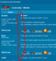
I'm not sure what that means. Annotated screenshots please :) |
|
|
|
|
|
|
Unless I am mistaking the circled region had contrasted separating lines before?

|
|
|
|
|
|
|
|
Grr :( Poor separation of CSS classes in the template is screwing things up. I've had to remove the "zebra striping" since it looked bad without border collapsing, and border collapsing was causing other issues.
The second line was never there. I may make a hacky patch to allow re-enabling but getting migrated to phpBB3 is a better priority... |
|
|
|
|
|
|
This helps you keep track of where you last read too when there are pages of posts on a subject. I went right past myself just now. Only yourself see it as a different color when you a logged on. There shouldn't be any confusion now with the visual attached. 
|
|
|
|
|
|
|
| To find posts of yourself you can also look right: if you see an Edit button, that was posted by you. Does not apply to mods/admins. | |
|
|
|
|
|
| Zebra stripes are back (for viewtopic pages only), and your own posts will be on a darker background. Inter-post separators are just a 1px line now; with the contrast difference, and the button row, I think it's enough to delineate clearly. | |
|
|
|
|
|
I think Zebra stripes are not needed because the button row acts as a separator as well but the other improvements/alterations are just fine. |
|
|
|
|
|
|
I quite like the Zebra stripes it looks quite modern, and just makes it that bit easier to read :) I think the move to phpBB3 is an exciting venture when Maxim gets around to it. |
|
|
|
|
|
|
|
Hey, check the attachment.
I hadn't seen Jacko's post before, so the page was not in cache. No zebras! Nevertheless, after I refreshed the page (in Chrome) it did appear. Are the CSS styles loaded separately from the page (so a delay would explain) ? Anyone else experienced this ? 
|
|
|
|
|
|
|
| Browsers tend to cache CSS more aggressively than other content. | |
|
|
|