|
|
ForumsSega Master System / Mark III / Game GearSG-1000 / SC-3000 / SF-7000 / OMV |
Home - Forums - Games - Scans - Maps - Cheats - Credits Music - Videos - Development - Hacks - Translations - Homebrew |
View topic - SMS Street Fighter 2 ROM Hack
 |
Goto page Previous 1, 2, 3, 4, 5, 6, 7, 8, 9 Next |
| Author | Message |
|---|---|
|
|
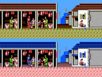
Very good eye. I have looked over as much of the GB stuff as possible. I had to remove the damaged roof tile, the bigger electric pole, and the original curb to gain the other tiles. I removed 2 floor tiles in the background as well, didn't seem to suffer from just repeating one tile instead. Everything else is the same. I wager to say the stage is done, and I'm pleased with the results. 
|
|
|
|
|
|
|
|
Considering you have no purple you've matched them well, the bottles on the table in the Turbo version are green, yours are still blue.
The only other nitpick, and it is a nitpick is the stepped roof on the right, i think it looks better like this. But that is an absolutely nothing thing all things considered. EDIT: Loving the new barbers pole! 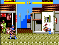
|
|
|
|
|
|
|
Great! I'll make those changes. I JUST made the change on the barbers pole lol Forgot all about it. |
|
|
|
|
|
|
| I like the floor color of the turbo version, but in WW it still looks quite pink. Have you tried making it lighter and more yellow? | |
|
|
|
|
|
I have tried playing with the colors a bit. Originally I had a much brighter pink for the dark outline of the floor, (The first draft I showed) but I replaced it with a darker color which looks much better imo. I tried playing with lighter yellows, I couldn't get something that was better than what is already. I'm not put off by the existing colors, tbh. The other stage that I think is complete is Balrog's stage. So I'll put up what I have for that as well. The yellow in Balrog's WW version might have to be replaced by white, I won't know till I finish Balrog's graphics just an fyi 
|
|
|
|
|
|
|
|
I think the Girls in the turbo version may be better in Purple, I know in the arcade one is in purple rather than blue.
Just attaching the original background, I think Balrog's stage really shows the difference as it started out as little more than abstract lines and faces and turned into something that is actually fairly representative of the arcade stage, all within the same limitations. 
|
|
|
|
|
|
|
The snes version seems to have both blue and red (Plus they're entirely different graphics from WW for whatever reason) I'm not opposed to putting in purple, however. It looks pretty good, tbh. I'm strongly leaning that way. 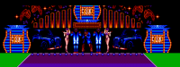
|
|
|
|
|
|
|
|
I don't think she is really purple in the arcade. It's more something between blue and purple.
But it's a hard choice purple looks nice with all the surrounding blue. But the dark red and dark purple colors look too much alike imho. Blue and red has nicers gradients. |
|
|
|
|
|
|
How about if the dark blue stays, instead of dark red? 
|
|
|
|
|
|
|
| The palette work looks incredible, I wish they could fix the control response, it was the most traumatic part of this version and it seems to me that it doesn't justice to the power of the Master System. | |
|
|
|
|
|
| Are you using every tile available on the Balrog stage? | |
|
|
|
|
|
Yes, pretty much every stage I'm using every last tile |
|
|
|
|
|
|
I thought so but had to check, if you had 2 or so left I was going to suggest putting a top hat on the guy on the left. To squeeze as much as possible from every last tile😆. |
|
|
|
|
|
|
Wow! This work is incredible. I can't believe the level of detail you're getting out of the Master System. It doesn't even look like the original developers tried with their port, it was just a quick port to get the game out by the look of it. The SMS was truly an under rated system. It truly is too bad something can't be done about the control. |
|
|
|
|
|
|
XD No problem, I enjoy the feedback.
It really was an underrated system. Growing up, I only knew 2 kids that had the system. It was a shame. I remain amazed to this day. I'm still discovering games I had no clue existed. 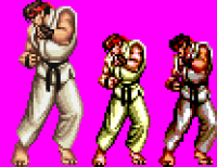
|
|
|
|
|
|
|
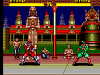
Without being too harsh on Tectoy I assume they had a very small staff and we're trying their best to get a selection of games out, by 1997 European developers had dropped off so they couldn't import, it was just Tectoy making games for a whole system. It looks like there was an automated program to reduce sprites and convert the first 60 or so tiles from the right hand side of each stage and the floor from a 16 bit versions background. With very little else done to clean it up. |
|
|
|
|
|
|
| I thought it was developed in Japan, although possibly for TecToy with a tiny budget and quality requirement. | |
|
|
|
|
|
| Regardless of how the original came about, this update is incredible. Great work. :) Definitely an underrated system. I've been loving all the great projects coming out for it lately. | |
|
|
|
|
|
| It was definitely developed by TecToy. There's information about it in the Visual Compendium book. Apparently they tricked a director at Capcom into thinking it was a 16-bit title! | |
|
|
|
|
|
No it was developed completely in Brazil by tec toy. The game was ported from Sega Genesis SF version via computer. |
|
|
|
|
|
|
|
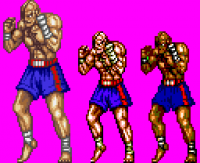
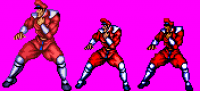
Last update for a while. As I said previously, I'm working on Ryu's sprites, and from there I'm going to work on nailing down all the fighters palettes and alt palettes (Creating all the idle graphics as well). I always had the colors in mind, but now it's time to put them to the test.
Sadly I couldn't get the P2 colors I wanted for Ryu (Black and blue outfit) I played around with the colors, but it's a bit of a juggling act when projectiles and effects are considered. For now I'm using a blue palette that fits with the P1 indexes. I'll tone down the colors later. Till next time. 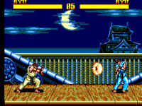
|
|
|
|
|
|
|
|
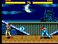
It's looking fantastic, I know you really wanted consistent fireballs and things but it looks great now regardless.
If you did want both sets of fireballs to be the same color you could redraw those graphics to use the same shades as Ryu's skin, that would also let you keep the red for the head band, fireball outline and being on fire etc... That said it looks great how it is currently, it matches pretty well to one of his Super street fighter 2 turbo pallets. |
|
|
|
|
|
|
Definitely food for thought. I played around with it a bit, replacing the red and orange of the fireball, and also replacing just the orange. Not really sure what I want to do with it. Also worth noting that Chun Li has different fire effects colors between P1 and P2. I'm not sure how important, or more to the point, possible, the consistency is through all fighters. Which is something I would want to achieve for all fighters, if I go for consistency. Anywho, these are my findings: Replacing both red and orange: Pro: Replacing both does give me any choice I want for the two headband colors. Con: Replacing both the red and orange kinda makes the fire effects look too bland imo. Replacing JUST orange: Pros: Fire effects don't look too off from the original. I could get the black color Ryu variant I wanted up and running. Con: I'm basically stuck with red for the headband color, for both P1 and P2. Overall Pro: Any color choices will have the same colored flame effects |
|
|
|
|
|
|
Chun Li and Ken have blues in both their background palettes (Assuming Kens water will be blue in both WW and Turbo color scheme). So you can use that for their fireballs and have their sprite palette counterparts have blue indexed the same spots. If both of Ryu's backgrounds contain blue then you can do the same thing and have his fireballs blue too. They are the only 3 characters who have blue fireballs, so you'll only have to do this for them. This will make the fireballs separate from the colors used for the characters clothes meaning you can do what you like without affecting projectiles.... Although thinking about, it may make Chun Li's standard colors difficult as you'll need more blue.... Maybe keeping everything orange would be better. |
|
|
|
|
|
|
The problem is that, depending on if the fighter is made of BG tiles or sprite tiles, you can't always access those additional stage colors. P2 palette is a sprite palette, with 12 colors. 9 once you take into account the transparent color, black, and white. The last 4 sprite colors are the UI colors. Which, maybe that can be of some value. Since they're black, red, yellow, and orange. |
|
|
|
|
|
|
I think you've miss understood me. To put in in a less convoluted way: You have a set of skin tones in the background palette and the same colors are in the same location in the sprite palette. Do the same for blue, Ken, Ryu and Chun Li's stage all have blue, just add it in to the same index spot on their sprite palettes. You are redrawing their sprites anyway, so you should be able to avoid using it for anything other than their projectiles. The big issue is that you've redrawn Chun Li and she has already used a lot of blue. 
|
|
|
|
|
|
|
| Yeah, I must be missing something. In the example images, you're suggesting to replace the pink colors with blue, for P2 Chun Li sprite palette? Won't that adversely affect the P2 fighter? | |
|
|
|
|
|
No, you are not missing anything. In that example it will look terrible....Which is why you'd have to redraw all the sprites to work around it. You'd also only have what, 2 colors to work with, 3 at a push? I'm pointing out blue would be possible, just not as practical as my other suggestion...😂 |
|
|
|
|
|
|
Credits have a mix of Japanese and Brazilian developers, so it seems to have been developed as a partnership https://www.smspower.org/Credits/StreetFighterII-SMS |
|
|
|
|
|
|
I dont know but i think that they are giving only the credits for original composition. For example: Tatsuya Nishimura https://capcom.fandom.com/wiki/Tatsuya_Nishimura I dont think that Nishimura himself composed the SMS version. But he appeared in credits like as owner of sound´s part. In Star Wars credits appear John Williams like as music´s author but i dont think that JW composed the SMS Star Wars music. BTW, the Brazil have the major japanese community out of Japan. Most the names can be from Sansei developers. |
|
|
|
|
|
|
ohhhhhhh lol, yeah I get what you're saying. I could probably get away with it with her reduced color palette. |
|
|
|
|
|
|
Yeah, now you get it, in reality, in the example above you would sacrifice the brown (that's near identical to the color next to it) and yellow or something like that from the skin tones and add extra blues there. Then redraw the skin to have more pink instead or not having it at all or something. I should have said it like this from the first post really. |
|
|
|
|
|
|
Good point! |
|
|
|
|
|
|
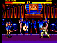
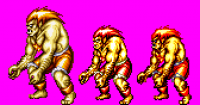
So I lied about being awhile till I update (I'm a dick) Doing what I said, getting the idle animations together for every fighter (Also the walking animations). I got Ken done. I like the result, but there are hard palette sacrifices to be made yet. I also got Balrog up and running. Thinking of replacing the white to the light yellow for the highlights. I can't have both unfortunately. So one or the other. The stage doesn't look bad at all with white swapped out. On the fence about it though.
|
|
|
|
|
|
|
Going to pop an update on this. Mainly so I can drop stuff for feedback. I have my work cut out for me at this point. So it's primarily art resource creation. I have figured out pretty much all the fighter's palette schemes. Tested 95% of the P1 and P2, testing burn state, shock state, and projectiles. The only one left is M. Bison, which has been some what vetted. Chun Li is my current sprite targeted to get done, but I also managed to get all the effects for each fighter done as well as some other animations I was interested in. My rough estimate for completion is about 2 months.


|
|
|
|
|
|
|
|
Great job on the pixel art, it looks amazing!
Yes, white or yellow. Another though call. The yellow works really well on Castlevania and other toned down stuff like Sailor Moon (as in the Golden Axe topic). For colorful games like SF2 i probably would lean towards white. White will pop the other colors more imho. I guess it works for a sunset stage like guile. Perhaps you can use white in the non-TURBO version of the stage. |
|
|
|
|
|
|
|
This is all looking fantastic. I love the changes you've made to Blanka's stage, the spectators in the window look much better. I have a suggestion to hide the gap in the skyline clouds by the pole.
The alternative colors look great, especially ken, I'm not sure there's an official game where he is blue. You've chosen well. I'd keep the white on Balrog's stage if you can. 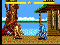
|
|
|
|
|
|
|
| Wow! Every time I see an update here it's just getting better and better! Thanks so much for the hard work. This is quality I wish Master System had been pumping out back in the day. The machine was so capable and the majority of the games barely scratched the surface of what it could do. Can't wait to play this!! | |
|
|
|
|
|
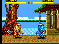
| Those updated sprites look great. My only minor niggle is that Blanka's skin is a little too yellow-brownish. Is there any way to make it a bit greener? | |
|
|
|
|
|
Yes, this exactly.
Good point, I will do something like in your example.
I'm not sure what snes sprite sheet I'm using as reference. It seems black is the default P2 color, but I see that blue is an option. I chose it because it's an easy one to step the gradient for.
I usually have Aseprite have a go with converting the source image. It did come up with something that looks decent (This isn't always the case). If I recall, I think the issue was that I wanted certain colors in the stage, and I compromised the colors between the fighter, stage, and various effects. 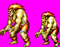
|
|
|
|
|
|
|
|
I see, I didn't factor in the stage colours.
Still, I actually think that Asesprite's approximation is closer to the original, with the greenish shadows and the paler yellow. Only the medium brown in the skin looks out of place and it doesn't make sense at its position in the colour ramp anyway. Looking at sprite sheets on the spriter's resource website, It seems to me that the SNES port has already shifted Blanka's skin tone towards yellow a bit, it seems slightly more greenish in the arcade version. However, if you look at how Blanka is depicted throughout the series, for example in Street Fighter Alpha, I think it's safe to say that he's supposed to be green, not yellow. Losing that completely seems wrong, even if the result in its own right looks as great as your version. |
|
|
|
|
|
|
If xfixium posts the level palette would you be able to suggest a better selection from it? |
|
|
|
|
|
|
|
This is what I could come up with quickly. From left to right: Arcade, SNES, xfixium's version, my mockups (2).
All I did in the first picture was replacing the orange (255,170,0) in the colour ramp of the skin with (170,170,0), which gets the overall impression already quite close to the original shade. It gets even more convincing if you replace the white with the palest yellow (255,255,170), like I did in the second picture. Of course you'll have to think about what to do with the rims of Blanka's pants then, as these already contain (170,170,85) which is so close to (170,170,0) that it doesn't make sense to have both shades in the palette. 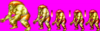
|
|
|
|
|
|
|
I tested this, it looks like it doesn't conflict with anything outside of Blanka. It would've been an issue had there not been an additional orange color. As I use that color for various other effects (Electric thunder attack, flames) I will still use white however, as it provides more color separation versus light yellow, plus I think the stage is using it. The arcade sprite has a decent amount of separation between it's lightest yellow and the next color. Your suggestion definitely matches closer to the original colors. Although, if I'm being honest, the old color does look more appealing to me. But I think in this scenario, it's probably more important to remain accurate to the original. I also tried messing with the shorts, I can't remove red though. The snake on the stage needs that color. There may be other answers, I've provided the current graphics and proposed palettes, to play with. The first Blanka is the og color scheme, for reference. The stage floor is not completed yet. Also, Emrabt's suggested edit has not been applied yet. 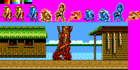
|
|
|
|
|
|
|
|
The original arcade graphics are too bright. I wonder what kind of (gamma?) correction it needs to make them like the snes colors. Does anyone know?
Can you make the clouds higher around the tree? Or would that require additional tiles? The red does not go well with the green. So i vote for the yellow version. |
|
|
|
|
|
|
Well, the original is …the original, so it would probably be more accurate to say that the graphics of the ports are too dark. However, I'm quite sure the artists always tried to get the best out of any given platform they were working on, so maybe we just have to be a bit careful when comparing them and have to accept that a 1:1 match is neither accurate nor desirable. The dominance of brighter colours is something that's very noticeable in a lot of CPS games, so my guess is that it's somewhat hardware related.
I think it looks fine. The complementary colours of skin and pants/hair are kind of the point of Blanka's character design, aren't they? While I agree that the colour ramp in the yellow version is cleaner and easier on the eyes, I much prefer the green version. My memory of Street Fighter lore is a bit hazy, but wasn't it part of Blanka's backstory that he ate chlorophyll to get stronger which led to a permanent change of his skin colour or something like that? |
|
|
|
|
|
|
| Semi-related, you may be interested in the stuff at https://fabiensanglard.net/sf2_sheets/index.html and other recent blog posts on the same site about the game. | |
|
|
|
|
|
That's very interesting, thanks for sharing |
|
|
|
|
|
|
| In regard to trying to match Blanka to the original. I really wouldn't worry about it too much. There are color palettes to contend with and your original effort looks great. Play to the Master Systems strengths. | |
|
|
|
|
|
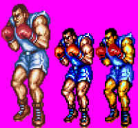
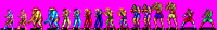
I think this will be the approach I will take in the end. I got around to switching the player select graphics out, as someone suggested earlier. Attaching them for feedback. I made some changes so that I could get all the colors on one palette, instead of dividing them for Blanka specifically. Thank you to all that have commented, you've helped shape this into a better project. 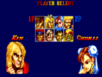
|
|
|
|
|
Goto page Previous 1, 2, 3, 4, 5, 6, 7, 8, 9 Next |