| Author |
Message |
- Joined: 09 Jun 2014
- Posts: 411
|
 Posted: Wed Oct 13, 2021 10:26 am Posted: Wed Oct 13, 2021 10:26 am
|
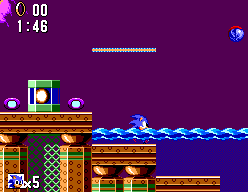
Similar to the flame in Marble, i've also added a flame in Scrapbrain.
|
| |
  
|
- Joined: 09 Jun 2014
- Posts: 411
|
 Posted: Sun Oct 17, 2021 11:35 am Posted: Sun Oct 17, 2021 11:35 am
|
For now i have removed the invincibility music. I've asked Valleybell if he knows what the problems could be.
I'm working on the Jungle stage now. It's a bit of a challenge to make it work. One issue is that the Genesis Springyard stage has mostly solid blocks, while the SMS Jungle stage consist of mostly "jump-through" blocks. In my version it will be a bit hard to differentiate the background from the foreground. I guess that is the reason Ancient chose to drop Springyard and create the alternative Jungle stage.
Another issue is the water which looks out of place. I'm not sure what i will do with it yet. I'll have to keep some of it at the few places where Sonic is submerged and slowed down.
The waterfall and flowing water have no purpose so i could remove them, and replace them by.... something.
Later, i will also change the bonus stage and the music. I'm not sure if i can make it interesting with the Genesis graphics, but i'll do my best.
|
| |
  
|
- Joined: 06 Aug 2015
- Posts: 155
|
 Posted: Sun Oct 17, 2021 8:11 pm Posted: Sun Oct 17, 2021 8:11 pm
Last edited by EmuBoarding on Sun Oct 17, 2021 10:40 pm; edited 1 time in total
|
slogra wrote For now i have removed the invincibility music. I've asked Valleybell if he knows what the problems could be.
I'm working on the Jungle stage now. It's a bit of a challenge to make it work. One issue is that the Genesis Springyard stage has mostly solid blocks, while the SMS Jungle stage consist of mostly "jump-through" blocks. In my version it will be a bit hard to differentiate the background from the foreground. I guess that is the reason Ancient chose to drop Springyard and create the alternative Jungle stage.
Another issue is the water which looks out of place. I'm not sure what i will do with it yet. I'll have to keep some of it at the few places where Sonic is submerged and slowed down.
The waterfall and flowing water have no purpose so i could remove them, and replace them by.... something.
Later, i will also change the bonus stage and the music. I'm not sure if i can make it interesting with the Genesis graphics, but i'll do my best.
NiCE!!! =)
|
| |
 
|
- Joined: 09 Jun 2014
- Posts: 411
|
 Posted: Sun Oct 17, 2021 10:07 pm Posted: Sun Oct 17, 2021 10:07 pm
|
The graphics from the bonus level have to be resized (and retouched) to fit in the compressed space
|
| |
  
|
- Joined: 06 Aug 2015
- Posts: 155
|
 Posted: Sun Oct 17, 2021 10:40 pm Posted: Sun Oct 17, 2021 10:40 pm
|
slogra wrote The graphics from the bonus level have to be resized (and retouched) to fit in the compressed space
Great!
slogra, how did you reduce the size of the Genesis Sonic to the Master's size? I wanted to try that with Genesis' Decap Attack for Master's Psycho Fox.
How did you do this miracle? hahaha

|
| |
 
|
- Joined: 09 Jun 2014
- Posts: 411
|
 Posted: Mon Oct 18, 2021 7:40 am Posted: Mon Oct 18, 2021 7:40 am
|
Hard manual labor :). There is no way to resize pixel art automatically with good results.
First i change the colors to sms colors.
Then i resize with most simple resize method, which gives you a bit ugly image.
Then i zoom in both the original and resized version to the same size, so i can switch easily and compare directly.
Then i manually cleanup the image to my liking.
|
| |
  
|
- Joined: 09 Jun 2014
- Posts: 411
|
 Posted: Mon Oct 18, 2021 8:48 am Posted: Mon Oct 18, 2021 8:48 am
|
In case of decap you will have to make sure the black outline is there in the resized version to make it look nice. And i noticed Psycho fox has no dark grey, so you have either change the palette or just use black for that.
You can use orange for the red.
If you change the palette then it might affect other sprites as well, so be careful.
Btw Although I've started working on Sonic bonus, the Jungle is far from finished. Only what you see in the screenshot is done, other parts of the levels are still a huge mess.
The release is postponed but i realized it will be so much more complete if i get this done.
|
| |
  
|
- Joined: 09 Jun 2014
- Posts: 411
|
 Posted: Mon Oct 18, 2021 9:53 am Posted: Mon Oct 18, 2021 9:53 am
|
With the Sonic sprite i had the luxery that the sms has the same amount of frames as the genesis. Also the frames were fairly big (3x4 tiles) and no tiles were reused in other frames.
I don't know if that is the case with Psycho fox sprites.
|
| |
  
|
- Joined: 06 Aug 2015
- Posts: 155
|
 Posted: Mon Oct 18, 2021 2:43 pm Posted: Mon Oct 18, 2021 2:43 pm
|
|
Thank you for the tips. I'll try
|
| |
 
|
- Joined: 09 Jun 2014
- Posts: 411
|
 Posted: Tue Oct 19, 2021 8:30 am Posted: Tue Oct 19, 2021 8:30 am
|
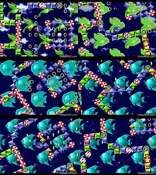
I was only able to fit a select number of graphics in the compressed space. The fish and bird are beautiful if i say so myself. But due to the lack of different graphics the bonus level will be a bit boring as expected.
I would like to add some more stuff, that does not take much space. I'm thinking of adding a gradient "sky" effect with blue colors which should be easy to compress if i use just horizontal lines (and no dithering).
I might have to drop the small bubble or one of the colored blocks to make some space though.
Or i might make the bird and fish even smaller (64*64), but then they will be much less impressive. It will also be easier to repeat in the map space as a tile group is also 64*64.
|
| |
  
|
- Site Admin
- Joined: 19 Oct 1999
- Posts: 14959
- Location: London
|
 Posted: Tue Oct 19, 2021 8:34 am Posted: Tue Oct 19, 2021 8:34 am
|
|
I feel like you are constrained by matching the existing compressed sizes, could you work on breaking free from that restriction? As there is a disassembly, I think you might consider patching the addresses and either expanding the ROM or swapping in a better compression method.
|
| |
  
|
- Joined: 09 Jun 2014
- Posts: 411
|
 Posted: Tue Oct 19, 2021 8:58 am Posted: Tue Oct 19, 2021 8:58 am
|
Hi Maxim, you are absolutely right, as usual :). It would be absolutely fantasic if i could squeeze in more tiles.
In many levels the compression is not a huge issue though. I was able to use most tiles there.
The bonus level and robotnik would gain a lot with more space.
You proposed the same in the other topic. I have zero coding experience on the sms though, so i don't think i'll be able to do it.
In the bonus stage the compressed map is also a big issue.
|
| |
  
|
- Joined: 23 Jan 2010
- Posts: 458
|
 Posted: Tue Oct 19, 2021 9:28 am Posted: Tue Oct 19, 2021 9:28 am
|
Quote I was only able to fit a select number of graphics in the compressed space. The fish and bird are beautiful if i say so myself. But due to the lack of different graphics the bonus level will be a bit boring as expected.
I would like to add some more stuff, that does not take much space. I'm thinking of adding a gradient "sky" effect with blue colors which should be easy to compress if i use just horizontal lines (and no dithering).
I might have to drop the small bubble or one of the colored blocks to make some space though.
Or i might make the bird and fish even smaller (64*64), but then they will be much less impressive. It will also be easier to repeat in the map space as a tile group is also 64*64.
The Genesis bonus level use a different background than you want do. The background change to different patterns that you obviously dont will get. I think that you can chose only 1 pattern (fish or bird). If you can change the patterns to each time that bonus level appear would be great, if not, is what we can have.
|
| |
 
|
- Joined: 09 Jun 2014
- Posts: 411
|
 Posted: Tue Oct 19, 2021 9:44 am Posted: Tue Oct 19, 2021 9:44 am
|
The tiles and the tilegroups (8*8 tiles) are the same (reused) for all bonus levels. So it is not possible to save any space by leaving out the bird or fish in a level.
And obviously the animations from genesis will not be included.
|
| |
  
|
- Joined: 09 Jun 2014
- Posts: 411
|
 Posted: Tue Oct 19, 2021 9:53 am Posted: Tue Oct 19, 2021 9:53 am
|
I want to use the fish and bird in different parts of a level.
This is the first bonus level so far. At the left i put the fish, in the middle the birds, and the right is unfinished, probably fish again.
|
| |
  
|
- Joined: 23 Jan 2010
- Posts: 458
|
 Posted: Tue Oct 19, 2021 2:09 pm Posted: Tue Oct 19, 2021 2:09 pm
|
|
Great graphics!
|
| |
 
|
- Site Admin
- Joined: 19 Oct 1999
- Posts: 14959
- Location: London
|
 Posted: Tue Oct 19, 2021 2:50 pm Posted: Tue Oct 19, 2021 2:50 pm
|
|
Now I’m tempted to attack these space issues and also add the background animation :) slogra, do you have some source management for this or is it not done that way?
|
| |
  
|
- Joined: 09 Jun 2014
- Posts: 411
|
 Posted: Tue Oct 19, 2021 3:32 pm Posted: Tue Oct 19, 2021 3:32 pm
|
No source management i'm afraid. What exactly do you need? I can give you the latest patch.
What kind of animations do you think are possible?
|
| |
  
|
- Site Admin
- Joined: 19 Oct 1999
- Posts: 14959
- Location: London
|
 Posted: Tue Oct 19, 2021 5:04 pm Posted: Tue Oct 19, 2021 5:04 pm
|
|
I was thinking of trying to implement a hook to update say one tile per frame, assuming there is time for that. This would allow me to update, say, a 48x48px area at just under 1fps, with some "rippling" through it. This seems like it might work OK for this case; but the actual numbers might vary. It's really in need of some experimentation.
|
| |
  
|
- Joined: 23 Jan 2010
- Posts: 458
|
 Posted: Tue Oct 19, 2021 7:11 pm Posted: Tue Oct 19, 2021 7:11 pm
|
Quote I was thinking of trying to implement a hook to update say one tile per frame, assuming there is time for that. This would allow me to update, say, a 48x48px area at just under 1fps, with some "rippling" through it. This seems like it might work OK for this case; but the actual numbers might vary. It's really in need of some experimentation.
Im understanding wrong. Do you not is trying to claim that THIS (background layer flip) is possible in SMS?

|
| |
 
|
- Site Admin
- Joined: 19 Oct 1999
- Posts: 14959
- Location: London
|
 Posted: Tue Oct 19, 2021 7:23 pm Posted: Tue Oct 19, 2021 7:23 pm
|
|
Not with all the layers, no… and maybe it will need to have the birds in the same places as the fish rather than the opposite. It is actually a fairly simple tile animation effect.
|
| |
  
|
- Joined: 09 Jun 2014
- Posts: 411
|
 Posted: Tue Oct 19, 2021 7:54 pm Posted: Tue Oct 19, 2021 7:54 pm
|
@segarule, the current engine does not show animations in the bonus game, so I won't be able to do it. We will need some kind of miracle to get close.
@Maxim, sounds to me like a really cool idea. Do you have an example how that will look? It would be great if you can change the fish to the bird and back. And bubble to cloud too.
I'm think about a diagonal update of tiles... would something like that be possible?
Good news, I was able to change all bonus levels without much issues. Only the last level i had to treat differently due to lack of space, but it looks ok.
The levels looks much more relaxing than the previous Springyard theme i used for the bonus levels. If i add the Genesis bonus music you might fall asleep ;).
It just needs some more tweaking. I have used mostly blue blocks, so i'll add some color variation.
I might drop the red block though, because it is not in the Genesis (where it is purple). It will free up tilespace. And it will free up a color in the palette that i can use for an extra green shade, making the bird and green block look better.
|
| |
  
|
- Joined: 09 Jun 2014
- Posts: 411
|
 Posted: Tue Oct 19, 2021 8:46 pm Posted: Tue Oct 19, 2021 8:46 pm
|
What do you think about the new bird?
I'm not sure about it myself. The lighter green colors of the sms palette look too much alike, so i might as well not add the extra color.
|
| |
  
|
- Joined: 23 Jan 2010
- Posts: 458
|
 Posted: Wed Oct 20, 2021 12:21 am Posted: Wed Oct 20, 2021 12:21 am
|
Quote @segarule, the current engine does not show animations in the bonus game, so I won't be able to do it. We will need some kind of miracle to get close.
No problem. For me everything is very good. You did much more than i could expect for a hack. For say the truth a only thing that disturb me in years at SMS Sonic is the shield that not cover the entire body. But if nobody fixed it is because the work must be hard.
|
| |
 
|
- Joined: 09 Jun 2014
- Posts: 411
|
 Posted: Wed Oct 20, 2021 7:47 am Posted: Wed Oct 20, 2021 7:47 am
|
I was never bothered by the shield, but you are right, it should be bigger.
That is indeed very hard to do, because it requires more tiles, more than Sonic himself.
|
| |
  
|
- Site Admin
- Joined: 19 Oct 1999
- Posts: 14959
- Location: London
|
 Posted: Wed Oct 20, 2021 8:05 am Posted: Wed Oct 20, 2021 8:05 am
|
|
It’s practically limited to the width of Sonic, rather than height. Drawing it wider would make sprite flicker happen more.
|
| |
  
|
- Joined: 09 Jun 2014
- Posts: 411
|
 Posted: Wed Oct 20, 2021 8:35 am Posted: Wed Oct 20, 2021 8:35 am
|
|
The shield is not an additional sprite. It is just another frame of Sonic animation. So you have to do something like the jumpframe where 1 additional tile for Sonic's shoetip has been added. However the shoetip tile is always in always in tile memory. You probably need at least 8 extra tiles for the shield. 4 left and 4 right of Sonic. And it should flicker.
|
| |
  
|
- Joined: 09 Jun 2014
- Posts: 411
|
 Posted: Wed Oct 20, 2021 8:53 am Posted: Wed Oct 20, 2021 8:53 am
|
I can make the shield slightly bigger, by making it taller.
It is round in 1:1 par now. But if i honor the sms aspect ratio, then it should be taller than wide.
|
| |
  
|
- Joined: 09 Jun 2014
- Posts: 411
|
 Posted: Sat Oct 30, 2021 7:50 pm Posted: Sat Oct 30, 2021 7:50 pm
|
Small update:
The bonus levels are basically done. The levels are easy to change because they have very little details and platforms. So i'm free to do whatever i want.
The jungle levels however are a tough nut to crack. Almost all tile(block)s need to be changed, while keeping the layout/gameplay/platforms the same.
Springyard on the Genesis has many details like shadows, which may not be that apparent when you first look at it. I'm trying to put those in the Jungle level. The basics are there in Jungle 1, it still needs more work though.
Jungle 2 is another story. It shared mapdata with the Bonus 4. And for some reason it is fairly easy break/corrupt Bonus 4, when i work on Jungle 2.
|
| |
  
|
- Joined: 09 Jun 2014
- Posts: 411
|
 Posted: Sat Nov 13, 2021 12:25 pm Posted: Sat Nov 13, 2021 12:25 pm
Last edited by slogra on Sun Nov 14, 2021 1:14 pm; edited 3 times in total
|
After a long fight with the rom, i was able to change Jungle into Springyard. The changed Bonus levels are also in this version.
Maxim squashed some bugs in the level editor, which finally enabled me to change Jungle2/Bonus4 without corrupting the rom.
You can help me by checking if all platforms still behave the same as in the original game.
Let me know if there are things that really bother you.
I'm out of ideas, so if you have any ideas let me know.
There is still some free tilespace in Jungle/Springyard, so it is possible to add some graphics there.
Map/layout space is limited though, which is the reason i could not add more details.
I will keep background of Scrap Brain and Sky Base the way they are (a bit of an anti climax). The enemies and music are changed though.
The graphics of Scrap Brain are already close to the Genesis version, so I don't know how to improve it.
I tried adding shadow to the pipes, but there are not enough tileblocks for that, as almost all are in use. Instead i added the chimney flame, which fills the tilespace.
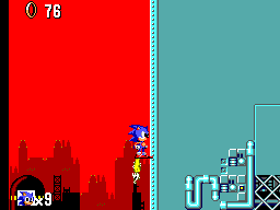
Sky Base 1 is hard to change into green like Star Light, because palette limitations. Blue is also used for the clouds, so i cannot just swap blue to green in the palette. And it shares tiles with the zeppelin in Sky Base 2.
|
| |
  
|
- Joined: 09 Jun 2014
- Posts: 411
|
 Posted: Sat Nov 13, 2021 1:38 pm Posted: Sat Nov 13, 2021 1:38 pm
|
Screenshots
|
| |
  
|
- Joined: 09 Jun 2014
- Posts: 411
|
 Posted: Sat Nov 13, 2021 2:02 pm Posted: Sat Nov 13, 2021 2:02 pm
|
Bonus screenshots
|
| |
  
|
- Joined: 21 Aug 2012
- Posts: 365
- Location: Berlin, Germany
|
 Posted: Sat Nov 13, 2021 9:29 pm Posted: Sat Nov 13, 2021 9:29 pm
|
slogra wrote Bonus screenshots
It looks insanely good. The screenshots are makin´ me speechless. Outstanding work, buddy.
|
| |
  
|
- Joined: 23 Jan 2010
- Posts: 458
|
 Posted: Sat Nov 13, 2021 9:37 pm Posted: Sat Nov 13, 2021 9:37 pm
Last edited by segarule on Sun Nov 14, 2021 12:37 pm; edited 1 time in total
|
I tested the hack. Congratulations.
My impressions:
1 - I like how you managed the problem with shield. You gave a transparency feeling on it;
2 - The spring yard zone is great but the way to chaos esmerald in act 1 is messy. Please see the screenshots:
I think that you could "open" the way to solve how the gamer will find the chaos emerald or you can add a "Down" text to point the emerald.
3 - The scrapbrain zone have a bug. I dont know if it already existed in original.
4 - The bonus stage is very very good. But the colors walls are with different colors sometimes. I dont know but IMO you could fix only 1 color to walls.
Anyway you did a excellent job here.
|
| |
 
|
- Joined: 09 Jun 2014
- Posts: 411
|
 Posted: Sun Nov 14, 2021 10:34 am Posted: Sun Nov 14, 2021 10:34 am
|
Gordman wrote slogra wrote Bonus screenshots
It looks insanely good. The screenshots are makin´ me speechless. Outstanding work, buddy.
Thank you!
segarule wrote I tested the hack. Congratulations.
My impressions:
1 - I like how you managed the problem with shield. You gave a transparency feeling on it;
2 - The spring yard zone is great but the way to chaos esmerald in act 1 is messy. Please see the screenshots:
I think that you could "open" the way to solve how the gamer will find the chaos emerald or you can add a "Down" text to point the emerald.
3 - The scrapbrain zone have a but. I dont know if it already existed in original.
4 - The bonus stage is very very good. But the colors walls are with different colors sometimes. I dont know but IMO you could fix only 1 color to walls.
Anyway you did a excellent job here.
Thanks for playing and your feedback!
1. I'm glad you like it :)
2. Yes, you are right. It is not clear enough. I changed it a bit.
3. Oops! The flame was not in the original and it supposed to be background. I fixed it.
4. Actually i wanted even more color variation. In the genesis version the colors of the "walls" varies a lot. However there is a restriction. The jumpads and the wall below are one block and it can only be one version/color. I choose blue, so that's why all jumppad walls are blue.
In bonus 4 there also was a map size restriction, which is why the walls are thicker (like in the original game) and most of them blue.
|
| |
  
|
- Joined: 23 Jan 2010
- Posts: 458
|
 Posted: Sun Nov 14, 2021 12:43 pm Posted: Sun Nov 14, 2021 12:43 pm
|
Quote 2. Yes, you are right. It is not clear enough. I changed it a bit.
Im looking your screenshot. I think that you could cut a bit more the wall above to give a "gate" idea for gamer.
But each time is better.
|
| |
 
|
- Joined: 09 Jun 2014
- Posts: 411
|
 Posted: Sun Nov 14, 2021 1:13 pm Posted: Sun Nov 14, 2021 1:13 pm
|
I've opened it a little more. But it should stay kind of a secret, imho.
i've updated the patch in my earlier post, if you want to try.
|
| |
  
|
- Joined: 04 Oct 2019
- Posts: 91
- Location: Brazil
|
 Posted: Sun Nov 14, 2021 1:57 pm Posted: Sun Nov 14, 2021 1:57 pm
|
|
This is becoming really good! Congratulations! =)
|
| |
 
|
- Joined: 09 Jun 2014
- Posts: 411
|
 Posted: Sun Nov 14, 2021 8:19 pm Posted: Sun Nov 14, 2021 8:19 pm
|
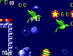
I finally changed the clouds in Greenhill.
To make them look nice a darker background is needed. I tried a few different colors of blue, but I settled for this blue, which doesn't clash with Sonic himself. It is actually somewhere in between the dark blue sky and the light blue water of the Genesis game.
I also changed the water to darker blue. And the flower is pink once again.
|
| |
  
|
- Joined: 06 Aug 2015
- Posts: 155
|
 Posted: Sun Nov 14, 2021 8:56 pm Posted: Sun Nov 14, 2021 8:56 pm
Last edited by EmuBoarding on Mon Nov 15, 2021 12:36 am; edited 1 time in total
|
slogra wrote I finally changed the clouds in Greenhill.
To make them look nice a darker background is needed. I tried a few different colors of blue, but I settled for this blue, which doesn't clash with Sonic himself. It is actually somewhere in between the dark blue sky and the light blue water of the Genesis game.
I also changed the water to darker blue. And the flower is pink once again.
Nice!
With the Maxim tool, it would be possible to make the Stages more similar to the genesis version?
|
| |
 
|
- Joined: 09 Jun 2014
- Posts: 411
|
 Posted: Sun Nov 14, 2021 9:01 pm Posted: Sun Nov 14, 2021 9:01 pm
|
|
What do you mean by phases?
|
| |
  
|
- Joined: 29 Mar 2012
- Posts: 900
- Location: Spain
|
 Posted: Sun Nov 14, 2021 9:46 pm Posted: Sun Nov 14, 2021 9:46 pm
|
|
If he's spanish speaking person, it means levels :-D
|
| |
 
|
- Joined: 09 Jun 2014
- Posts: 411
|
 Posted: Sun Nov 14, 2021 10:09 pm Posted: Sun Nov 14, 2021 10:09 pm
|
ah, i see, thanks.
I have no plans to do that. I don't think it will be possible to get close to the levels of the Genesis.
|
| |
  
|
- Joined: 06 Aug 2015
- Posts: 155
|
 Posted: Mon Nov 15, 2021 12:37 am Posted: Mon Nov 15, 2021 12:37 am
|
kusfo wrote If he's spanish speaking person, it means levels :-D
Portuguese... thx =)
slogra wrote ah, i see, thanks.
I have no plans to do that. I don't think it will be possible to get close to the levels of the Genesis.
ok
The Maxim tool make anything easier in your work?
|
| |
 
|
- Joined: 09 Jun 2014
- Posts: 411
|
 Posted: Mon Nov 15, 2021 8:52 am Posted: Mon Nov 15, 2021 8:52 am
|
While Maxim works on the tool, i report my findings to him while i use the tool.
He fixed a major bug, else i would be stuck with an unfinished jungle2/springyard zone. So i'm very thankful he was able to fix that.
He is adding awesome new features. The tool is much faster and easier to use already.
You can read what he has planned on github. One major thing will be expanding the rom to get rid of the compression restrictions. And also be able to edit the expanded rom in the editor.
|
| |
  
|
- Site Admin
- Joined: 19 Oct 1999
- Posts: 14959
- Location: London
|
 Posted: Mon Nov 15, 2021 1:44 pm Posted: Mon Nov 15, 2021 1:44 pm
|
It would be interesting to try to implement some of the Genesis level layout in the SMS version. Some things to note:
- the levels are not as big. You might need to add in Scarp Brain style “portals” between distinct areas. I haven’t figured out how this works yet to allow it to be edited, and it might not be easy.
- you can’t do loops. The physics engine won’t make Sonic roll around a loop, even if the blocks form a rough loop shape. Changing this would be very hard.
- the game suffers slowdown as soon as you get two badniks on screen at the same time. It might be possible to help this a little bit, or play on PAL settings to give it more time…
|
| |
  
|
- Joined: 09 Jun 2014
- Posts: 411
|
 Posted: Mon Nov 15, 2021 4:50 pm Posted: Mon Nov 15, 2021 4:50 pm
|
|
About the slowdowns. I think the monitors use 2 sprites. One for the monitor itself with noise. And another sprite with icon that overlaps. Is this true? It seems like a bad idea, but maybe there is no other solution.
|
| |
  
|
- Joined: 17 Aug 2021
- Posts: 81
|
 Posted: Fri Nov 19, 2021 12:17 pm Posted: Fri Nov 19, 2021 12:17 pm
|
While I don't think most stages need new layouts I do think the start of act 1 Jungle / Springyard needs reworking, at the moment it looks very fragmented and it's not clear what platforms are solid.
Other than that it's looking brilliant.
|
| |
 
|
- Joined: 09 Jun 2014
- Posts: 411
|
 Posted: Sat Nov 20, 2021 11:51 am Posted: Sat Nov 20, 2021 11:51 am
|
I'm aware of the Springyard issue, but i find it still playable after getting used to it. If you have any suggestions how to fix it, then i'm very interested.
I'm working on the Scrapbrain zone now. Trying to make it nicer by removing the grey color (ugly imho). I've also imported a couple of tiles from the Genesis.
Scrapbrain was the only level which lacked light brown and brown in the background palette. Those colors would be very useful to make a nicer ring. So i changed the palette quite a bit. Removing grey, removing a duplicate black which was necessary for the old ring, adding the 2 brown colors, and there was even space for the original orange sky color.
After that all palettes of each level had to be aligned, so all brown colors are at the same palette index.
Then it was possible to import the ring with many color shades. Even more than the Genesis :).
When losing the rings, graphics of the Sonic sprite are used. Which means it has very few colors. It is not really distracting in the game though.
Finally the ring in the hud. As you can see it looks different as well. This took me some time to get right, because it did not fit in the compressed space. In the end the only way was to make a vertical mirror. This way there are a lot of duplicate lines, which saves space.
|
| |
  
|
- Joined: 09 Jun 2014
- Posts: 411
|
 Posted: Sat Nov 20, 2021 12:07 pm Posted: Sat Nov 20, 2021 12:07 pm
|
I've changed the greenhill flowers (again).The sunflower looks OK. The pink one, perhaps not. I'm not a fan of dithering, but i used it here due to lack of colors.
|
| |
  
|


