|
|
ForumsSega Master System / Mark III / Game GearSG-1000 / SC-3000 / SF-7000 / OMV |
Home - Forums - Games - Scans - Maps - Cheats - Credits Music - Videos - Development - Hacks - Translations - Homebrew |
View topic - Sega Master System Boxart Font
 |
| Author | Message |
|---|---|
|
Sega Master System Boxart Font
|
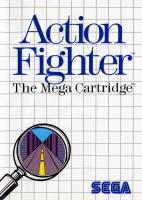
I'm sure this has been answered before but does anyone know which font is used for the sega master system games in particular the one shown on Action Fighter?
|
|
|
|
|
|
|
| I was reading something the other night that suggested the font was Pistilli Roman. | |
|
|
|
|
Revo
|
|
| Modern TwoSxtn ITC Std Medium - RVB: 3 / 56 / 111 | |
|
|
|
http://www.fontslog.com/moderntwosxtnitcstd-light-otf-31036.htm
Apply excessive, inconsistent kerning to get the authentic look. Edit: or the medium weight, I'm not entirely sure. |
|
|
|
|
|
|
Crap, never thought I'd have to pay for a font! Guess i'Il have to fork out for it. |
|
|
|
|
|
|
Yes, please get the kerning correct. A lot of people express poor opinions about the early SMS box art but whether you like it or not, it was executed with skill. It's usually obvious at a glance whether or not box art is authentic because fan art/detractor art is rarely done with attention to detail. The fonts are wrong, the sizes are wrong, the kerning is wrong, the grid is wrong, other details are mismatched in various ways (a 1988-style genre badge placed on a 1986-style cover)... Big D, are you planning on making the cover and/or other design elements of your book resemble an SMS box? If you need help making your work look true to the original designs, reach out to someone who knows what they're doing, because it's really disappointing to see poor imitations. Maybe I'm more uptight than most but it would really detract from the book in my eyes if the homage is botched. |
|
|
|
|
|
|
| Maybe I was a bit harsh... Yes, the original covers were produced using the technology of the time, so manual kerning and real cut and paste. The kerning is very tight (even overlapping at times) and very much a judgement call to give a consistent feeling of space between letters which is not the same as distance between them. | |
|
|
|
|
|
I already have an Image I want to use for the front cover so that's fine. What I was going to use it for was the titles of the games on each page. Ha as of yesterday I had never even heard of the word "Kerning", After a quick google search I now know it is the spacing between the letters. This is something that I had noticed when downloading fonts and trying them out, they defiantly had to much space between the letters and just didn't look right. Rest assured If I am going to use this font I will most definitely get it right or not use it at all because it will annoy me more than anyone else. Great to see someone so passionate about this |
|
|
|
|
|
|
Ok I got a copy of the ModernTwoSxtnITCStd font from a very generous donor to play around with and test. But as you can see from the image provided The Original image, ModernTwoSxtnITCStd-light, ModernTwoSxtnITCStd-medium in that order. I cant get it to look the same! Forget the spacing (kerning) for a minute if you look at the left side of the letter"A" I cant seem to reproduce how thin that first line is. Am I doing something wrong or is the best I can expect? 
|
|
|
|
|
|
Boxart font
|
|
If you're using Photoshop, be sure to set the anti-aliasing method to 'Sharp'.
Once you've applied the kerning, you'll find the slighly thicker hairline on the 'A' isn't even that noticeable. It's also worth noting that there's different kerning for every individual letter. |
|
|
|
|
|
|
Yeah I thought that but when I tried Sharp it was even thicker in photoshop. Bottom one is on Sharp setting. Just tried it in Wordpad and it seems fine, weird. 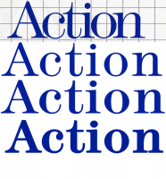
|
|
|
|
|
|
|
| I take it you don't have 'faux bold' highlighted ? | |
|
|
|
|
|
That was it! Thanks heaps! |
|
|
|
|
|
|
Good to hear :) yw. |
|
|
|
|
|
|
Thanks for offering up that tip about the anti-aliasing. It seemed to help mine look a bit closer. I'm embarking on a full box art set, and good lord, the kerning has been killing me! It's so inconsistent lol. I'm trying to get everything as close to authentic as I possibly can. I never thought I'd ever be spending 20 minutes on the font for one word before,...but here we are lol. Now, I'm stumped on what the font is for the "Action", "Shooting", "Arcade", etc. triangles and blasts in the upper left-hand corner of the box. The template I found as a starting point is using Arial for those, and I just noticed, when working on a Shooting game, that it most definitely is not Arial. |
|
|
|
|
|
|
I noticed, while embarking on my journey to do a complete front box art set for this system, that even the grid doesn't seem to be spaced uniformly. I took an example selection from a box front in photoshop, and filled my canvas with that selection to make a nice crisp new grid. Then brought the opacity down to try to match it up to the original grid, and noticed that when one square was exact, a few rows down, it wouldn't be. If I matched it exactly to say, the middle row, then it slowly went out of alignment moving out from the equator. So I just decided to go with the grid I had made, and just manually move the grid around to "split the difference" between all the rows and get it as close to how the original box was overall. I'll make judgement calls along the way if a line placement doesn't "cradle" a logo well, or just doesn't look right to me. I'll push it over a bit. I'm sure it has a little to do with the scaling i've had to do to fit everything into my canvas. Source art is all over the place for these boxes. I took my original grid sample from one of the higher resolution images I was able to find of "world Grand Prix". I center and scale up/down other boxes that don't match the canvas exactly, then delete their grid and try to match it closely by referencing the original box image and how it sits overall there. I have managed to, in my opinion, do a great job of matching all the fonts though. Even some game logo fonts (Carmen Sandiego). I have never spent this much time on individual kerning and scale of a font in my entire life! lol. But I gotta say, they did really put a lot of attention to detail in this. I would have never thought that there was such an amount of manual adjustments on these boxes before. Especially as a kid looking at these boxes. "Just so boring". Well yeah,....until you become a photoshop nerd when you grow up lol. |
|
|
|
|
|
|
This just popped into my head because i was wondering after thknking of more hypothetical demake boxarts to make and i was like "how the hell would i write strategy/tactics?" |
|
|
|
|
|
|
I figured the font for those out. As well as the font for other manufacturers that use their own "action" triangle. Jeez. So much inconsistency throughout. reddit has been great for font identification, as well as myfonts[dot]com/pages/whatthefont |
|
|
|
|
|
|
| Could you tell us what font you matched it to? | |
|
|
|
|
|
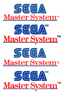
The Blast Effect in the upper left-hand corners, as far as I could match, is Franklin Gothic. And of course, I had to do each letter's kerning to get it as close to an actual cover's text. Just like every other piece on these covers lol. There's so many small details that are missed if you don't pay attention. All the way down to whether or not the ® is see-through, or has a white background in the circle. Whether or not there even is an ® next to the SEGA logo. If the TM is tall and narrow, or short and stubby (Arial Black). The custom fonts that other manufacturers like Parker Brothers used, Tecmagic, and various others. Sometimes the Virgin games logo has a black border, sometimes it doesn't. And so on, and so forth. I spent hours upon hours getting different "sega master system" logos as close to original as possible. The one with the "bulb" of the tail of the letter y being in-line with the blue line, but not above it, while still having the skinny part of the letter y swoop under the blue line took like 30 minutes. You wouldn't think it, but it isn't just the font typed with special kerning. It is actually two sets of different kernings on that letter. One for the skinny swoop part that goes under, and one for the bulb. But the skinny swoop doesn't go so far under as to leave a gap through which you can see the white background. Oh no way,...it rides that blue line. Which was custom skewing after all the kerning was done. Because it always wanted to show a gap, no matter what I did with the kerning. So I had to rasterize the layer and skew it manually until the bulb part was squished juuuuuust enough to not go over the blue line, and the swoop went under, but not too far! lol. Layered over each other; eraser, clone, 1px brush in red to fill in manually,..etc., etc. Image attached of the different ones I've had to make so far. Hopefully there isn't yet another variation to come. Also spent a very long time getting the A in the SEGA logo correct, because all the logos online have a large opening, or "inner triangle". Whereas, the actual boxes have a small inner triangle of white. But it still has to sort of keep the overall angle of that entire line that makes up the left angle and goes down to the foot of the A. That angle also doesn't follow a straight line though lol. It ever so slightly diverges off the angle it starts from in order to end up making the upper left part of the inner triangle more inward than it normally would be. I don't know if I'm explaining it very well. But, anyways. It's been maddening to say the least. Working backwards from the letter Z, I've made it up to K. It's very slow going. 
|
|
|
|
|