|
|
ForumsSega Master System / Mark III / Game GearSG-1000 / SC-3000 / SF-7000 / OMV |
Home - Forums - Games - Scans - Maps - Cheats - Credits Music - Videos - Development - Hacks - Translations - Homebrew |
View topic - Design detail on the Sega Control Stick
 |
| Author | Message |
|---|---|
|
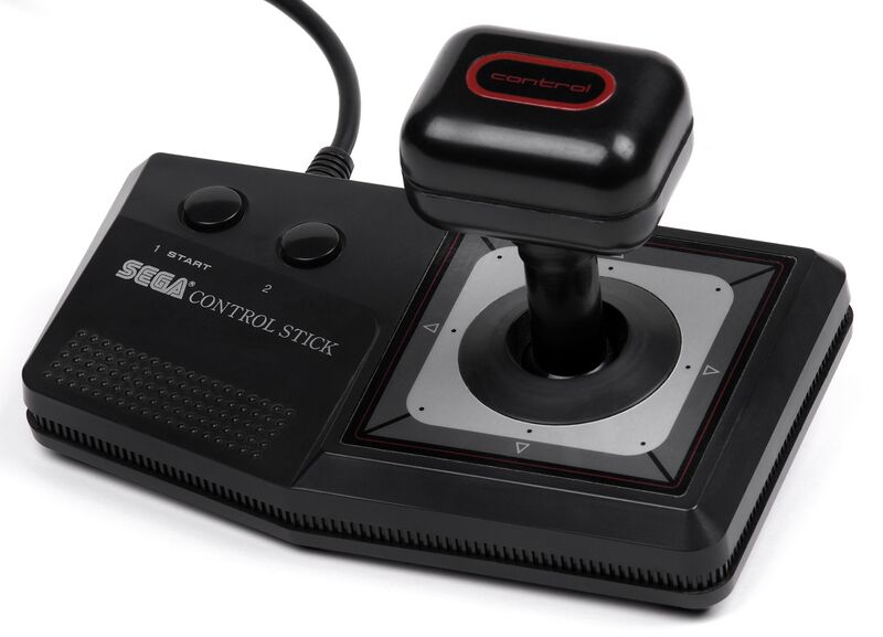
Design detail on the Sega Control Stick
|
The top of the joystick on the Sega Control Stick features a font that I don't think is used on any other SMS hardware. But I do seem to recall that some prototype versions of the console had a different bootup/BIOS screen, and maybe even a different font on the surface of the console itself. I wonder if this detail on the Control Stick might be a holdover from an early design guide for the entire line of hardware. What do you think?
|
|
|
|
|
|
|
| I see five typefaces on the Control Stick - I think it's just not that well designed. | |
|
|
|
|
|
Does that include the Sega logo? |
|
|
|
|
|
|
| Yes - although there may be another one or two on the bottom. | |
|
|
|
|
|
I finally found the image of the prototype Master System I remembered seeing. It looks like it is the same font as seen on the top of the Control Stick, so that is a link to the earlier design guidance:

From this thread on the prototype SMS M404: http://www.smspower.org/forums/6038-SMSPrototypeM404 |
|
|
|
|
|
|
| I'd forgotten the lowercase usage of that font... Strange that they changed the control stick body to the newer serif font but left that one alone. The START text seems like it may be the same font. | |
|
|
|
|
|
| I think thats the font which was also used on the Mega drive. | |
|
|
|